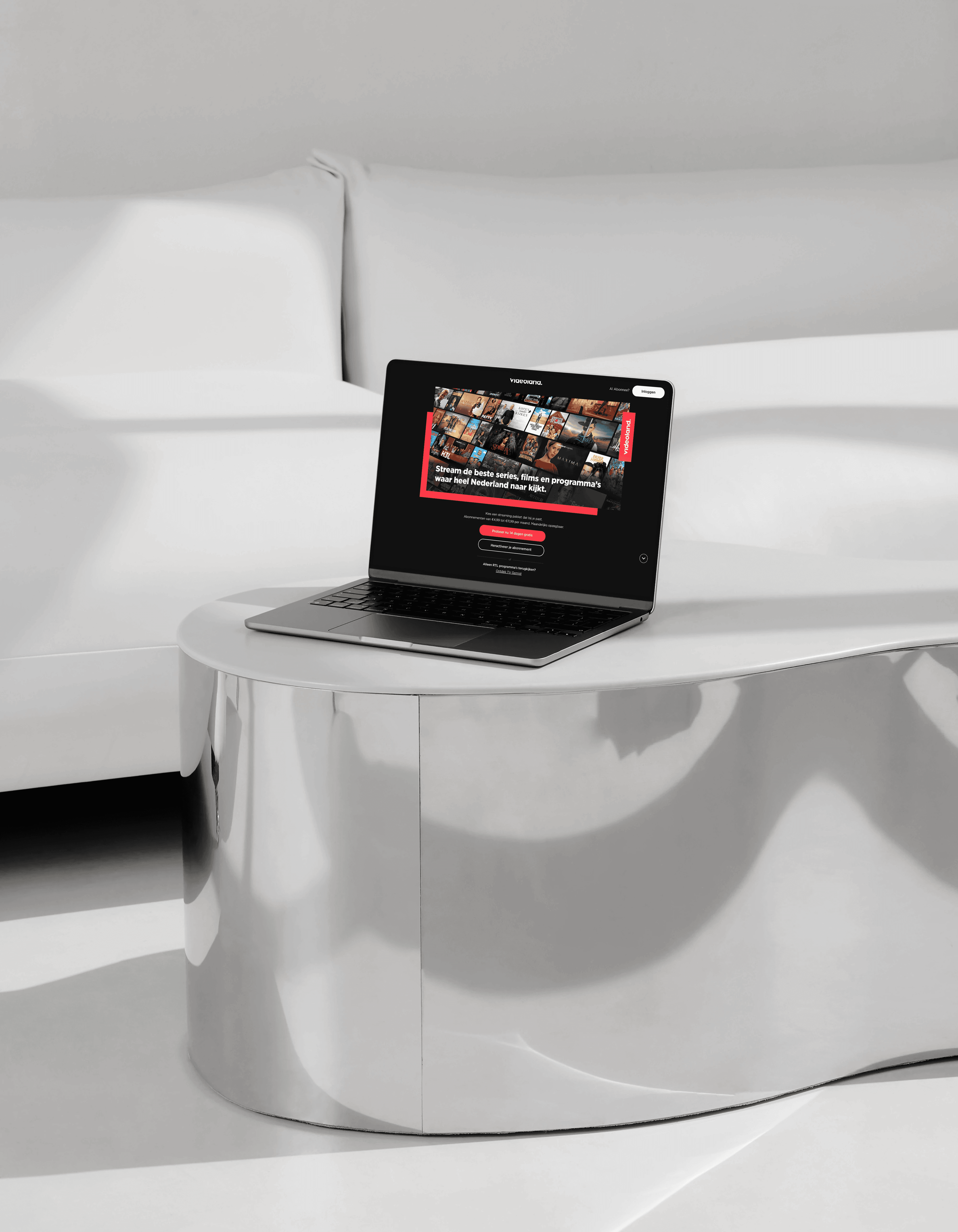
Videoland home page redesign
Videoland, the Netherlands' second-largest streaming service, sees millions of visitors on its homepage every year. But the design hadn't changed much in several years and no longer aligned with the newer Videoland branding already showcased across marketing campaigns. To strengthen brand identity and boost conversion, we decided it was time for a redesign.
RTL Nederland (Videoland)
RTL Nederland (Videoland)
6 months
June 2023 -
Jan 2024
6 months
June 2023 -
Jan 2024
We agreed we'd implement the redesign if the new homepage's conversion rate matched or beat the old one, validated through an A/B test. Since the main driver for the redesign was brand, not performance, an improved conversion rate wasn't strictly required to ship it, though we aimed to improve it wherever we could.
We agreed we'd implement the redesign if the new homepage's conversion rate matched or beat the old one, validated through an A/B test. Since the main driver for the redesign was brand, not performance, an improved conversion rate wasn't strictly required to ship it, though we aimed to improve it wherever we could.
We took a data-driven approach and worked across disciplines from the start, pulling together insights gathered over the previous couple of years from UX research, CRO and marketing, and sharing them in a joint brainstorm session.
We took a data-driven approach and worked across disciplines from the start, pulling together insights gathered over the previous couple of years from UX research, CRO and marketing, and sharing them in a joint brainstorm session.
Gather insights and inspiration from past research, CRO and marketing.
Run a workshop with stakeholders across teams: share insights and inspiration, define how-might-we (HMW) questions, brainstorm ideas against them, then present and vote on the strongest.
Turn workshop output and our own ideas into concepts.
Pre-validate the concepts with users.
A/B test the strongest version against the existing homepage.
Implement the winning version.
Each brainstorm participant sketched their own ideas on paper, working from four HMWs the group defined together:
How might we make the page's content fit the user's preferences?
How might we make it clear how Videoland's content differs from other streaming platforms?
How might we give users a good impression of our content offering?
How might we balance focus between returning customers and new customers?
Most of the work after the workshop fell to me. Over the following months I developed the ideas into several concepts and iterated on them closely with the other disciplines. We narrowed it down to two concepts, pre-validated both with users, and took the stronger of the two into the A/B test.
The new design led to a significant increase in overall conversion and was implemented.
The redesign was a real improvement, on brand and on conversion, but as with any homepage, the work doesn't stop at launch. The team kept running experiments to refine it further after implementation.